Hi, I’m Hayley, the person behind this website! I am a 24-year-old graphic designer who lives in Washington state with my 2 cats, Jasper and Nezuko! When I am not designing, I like to make other things with my hands, be out in nature, and explore new ideas while reading. Below, I have included 11 of my most current best works. Please, enjoy, and I hope to work with you soon!


personal Branding Package
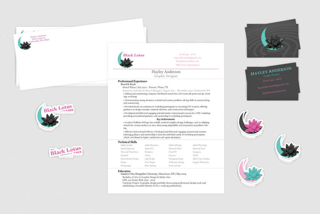
These are the personal branding items that I have created for myself and my career. Using Adobe Illustrator, InDesign, and Photoshop, I created a logo, business card, envelope, letterhead with my resume, and 5 different stickers to be used as leave behind objects. I used tools to create and edit shapes, color, and typography in the making of these pieces. Each element was carefully considered based on how it represents me as a designer and how they work together. The chosen brand logo, text, and colors have been thoughtfully used throughout each piece, creating a cohesive package. When creating this set for myself, I learned more about logo design, use of color, and how to create a beginner branding package.
Branding Package for Italian Restaurant (Pasta Amore)
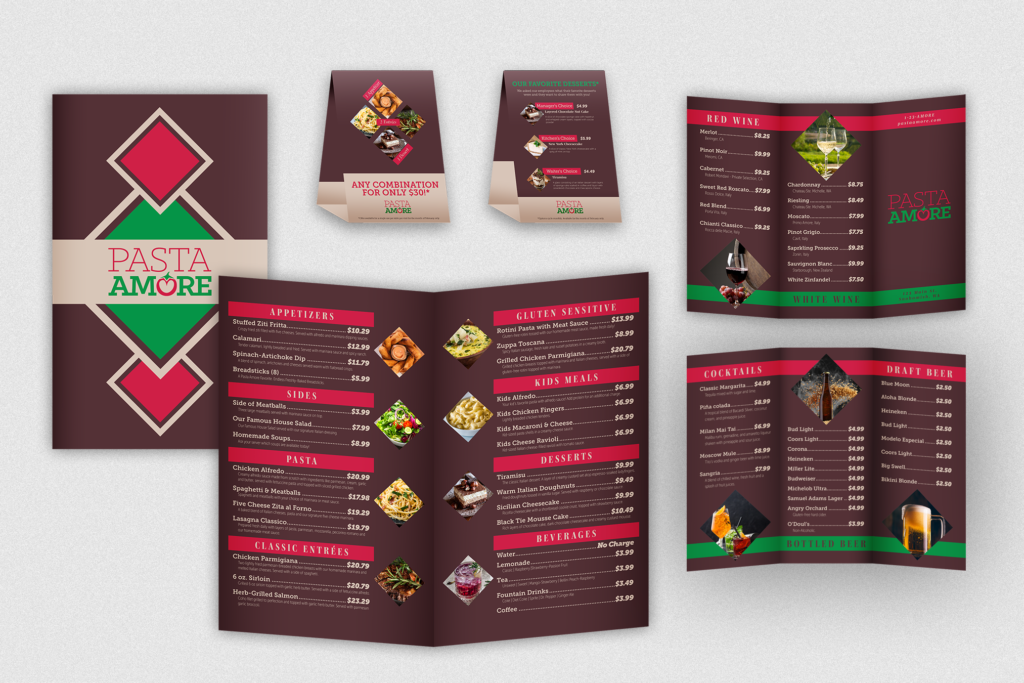
This branding package was created for a fictitious restaurant called Pasta Amore. Using Adobe Illustrator, InDesign, and Photoshop, I created a menu, tri-fold brochure, and table tent that met the standards of the brand. In making these designs, tools to create and edit shapes, images, and typography were used. Brand colors and diamond shapes are used throughout the pieces, creating a set that well represents the brand, together and individually. Another design element that was heavily used in this project is hierarchy, which can be seen in the text of each piece and how it is organized. When it came to the creation of each of these pieces, I learned a lot about how to thematically connect pieces, while still making each piece unique.
Branding Package for High End Bakery (Upper Crust Bakery)
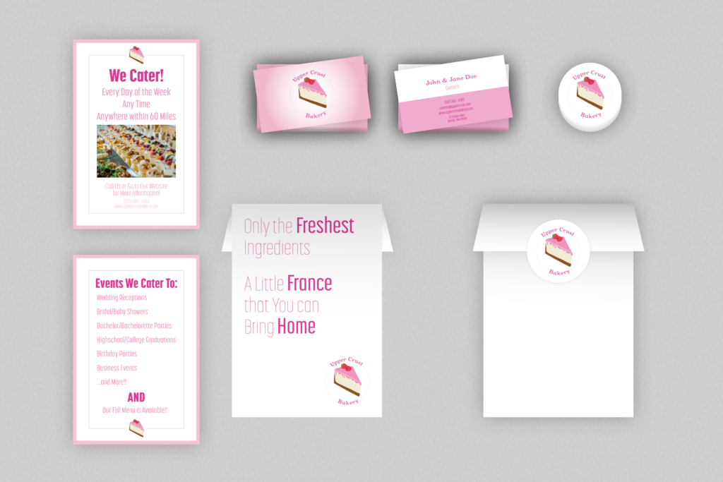
This branding package was created for a fictitious, French bakery called the Upper Crust Bakery. Using Adobe Illustrator and Photoshop, I created a logo, business card, catering card, bakery bag, and a sticker that are up to the brand’s standards. In making these, I used tools to create and edit paths, shapes, and typography. Since the logo was created first, each other piece was made to represent that logo. There were design decisions made for color, typography, space, and placement. One of the main elements that helps connect each piece is the pink brand colors. When it came to creating these pieces, I learned a lot about making design decisions that are best representative of the brand, rather than what is the most visually appealing.
Self-Promotion Album Cover
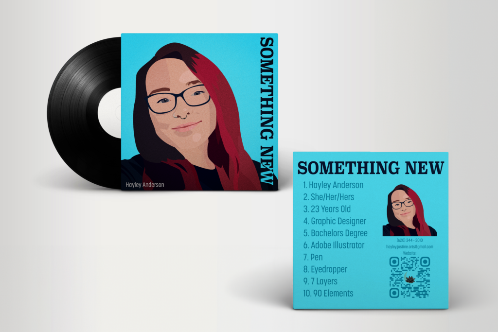
This album cover containing a drawn ‘selfie’ portrait was created using Adobe Illustrator and Photoshop. Tools were used to draw each shape and pick the color for those shapes from a reference image. Each shape was created and layered in a way to create depth and realism. When the drawing was finished, I was challenged to adjust the colors to create a more cohesive piece. A contrasting blue background is used to make the warm colors of the subject stand out more. When I created this piece, I used the pen tool to create basic shapes and then the anchor point tool was used to refine those shapes. This project allowed me to learn how to create smooth lines and shapes when drawing in Illustrator.
Dripping Calendar (February)
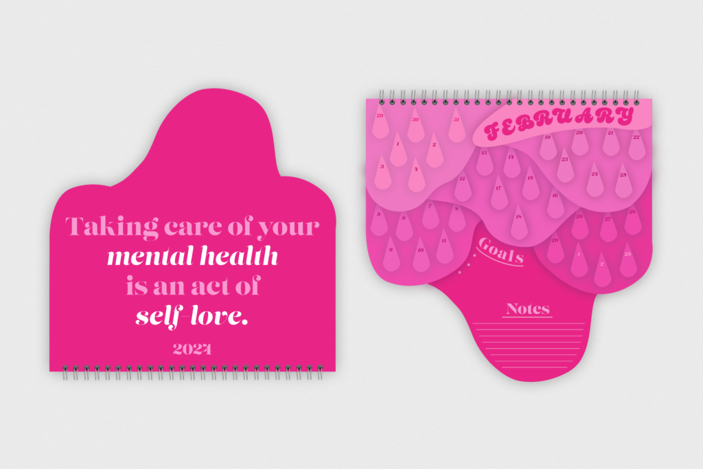
This piece is a dripping calendar that was created using Adobe Illustrator and Photoshop. I used tools to sketch my idea, create shapes, add type, and to create interesting details like the shadows. The goal was to create a calendar that was unique and did not use a typical box type grid for the days. A monochromatic color scheme has been chosen, so that each month is set apart by its own identifying color. In creating this piece, I challenged myself to focus on the shapes and how the layers would affect the readability and layout. The biggest takeaway I had from this piece was being able to practice using color in interesting ways to create a cohesive theme.
Sports Billboard Set
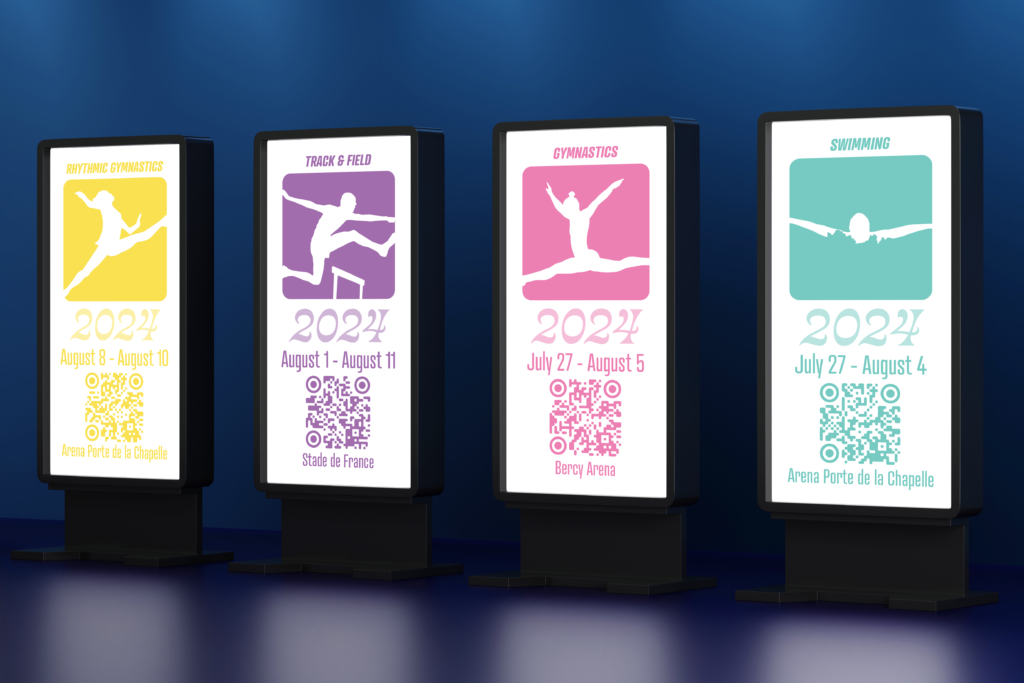
This piece is a set of sports pictogram billboards depicting a rhythmic gymnast, a hurdler, an artistic gymnast, and a swimmer created using Adobe Illustrator and Photoshop. Using reference images for each piece, tools were used to outline each individual and element, creating a silhouette that is well representative of the action taking place. After creating each athlete, I then had to create backgrounds for each of the pictograms that was both a well thought out theme as well as a color that was reminiscent of the sport depicted. In this piece, I was able to hone my skills of creating smooth lines and shapes in Illustrator. The most important thing I learned was how to create an image representative of a detailed photograph.
Hybrid Creature Challenge Set
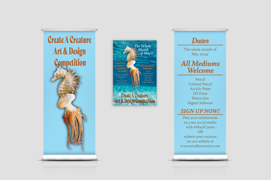
This piece is a banner and poster created for a hybrid creature design challenge and was made using Adobe Illustrator and Photoshop. The goal of this banner was to create something interesting and practical. The creature, a combination of a seahorse, jellyfish, and sea slug has been used as just one example of what an entry could be like. Important and clarifying information has been included in both pieces. When it comes to color, the type is all in colors pulled from the creature, and the background was chosen to be complimentary. I was able to practice my use of color in a way that would most benefit the subject and the readability of the type.
Publication Design Based on Zak Bagans
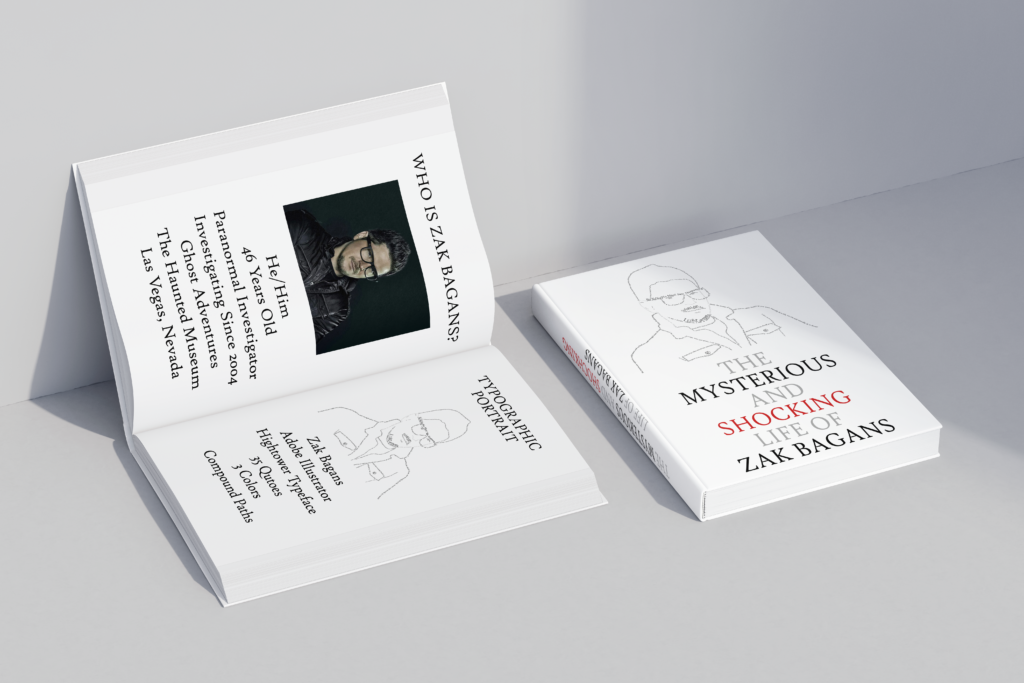
This piece shows a book cover and contents containing a typographic portrait of Zak Bagans, who is popular for his paranormal investigating shows, and was created using Adobe Illustrator and Photoshop. I found a reference image, did research on a font that would well represent my subject, and found quotes that I could utilize. I used tools to create each quote string by writing the text, then by making it a shape where each individual letter could be edited. Because I was going for a simple design, limited colors were used, and I focused on the size of each set of text. In the making of this project, I learned more about the hierarchy of text and how to use it to convey certain messages and images.
Magazine (Music Talks With Children)
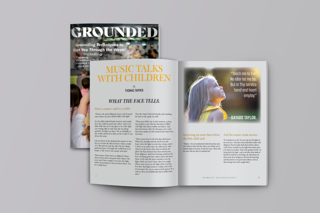
This piece is a of a magazine called Grounded and focuses on a spread titled Music Talks with Children created using Adobe InDesign and Photoshop. For this piece, I was given the type in a word document, and I was challenged to display it as if it were in a magazine. I sketched a few ideas based on the length of the text, and then focused on finding extra elements and colors that would work the best with this piece. Once I settled on the image of the little girl, I based my use of color on the prominent yellow from the image. When creating this piece, I learned about grid layouts with text and how that text should be organized based on hierarchy.
Magazine (Homage to the Typeface Hightower)
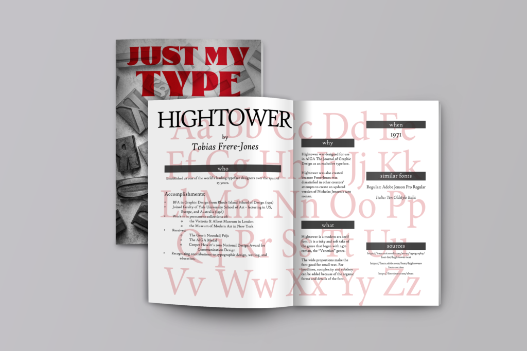
This piece is a of a magazine called Just My Type featuring a spread that pays homage to the typeface Hightower by Tobias Frere-Jones and was created Using InDesign and Photoshop. For this piece, I selected a typeface for a specific project, and I was tasked to do research and create an interesting layout that displays the information that I find about the font. I wanted a layout that displayed the whole typeface, rather than just the information that I was planning to provide. I used negative space and little shape to create the illusion of floating boxes. When it came to creating this piece, I learned quite a bit about how to display information in an interesting way and layout using a grid- like system.
Gallery Postcard
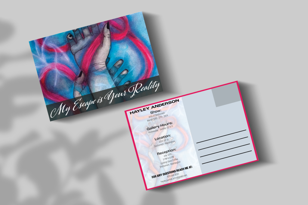
This piece is a postcard for a gallery show that was created using Adobe Illustrator and Photoshop. For this piece, I was challenged to create a post card for myself as if I were having a gallery or senior art show. I used a piece of traditional work for the background because I feel as though it is well representative of my work and shows what people could expect at the gallery. The type on the front was chosen to match the flowing of the ribbons, and a red border was chosen on the back to tie the piece together. When creating this piece, I learned a lot about photographing traditional work and how to use it along with other elements to create a cohesive piece.
